GBPUSD AnalysisLooking at the GBPUSD H1 chart you provided, here’s a breakdown of the current structure and a high-probability swing trade setup with a 1:5 risk-reward ratio:
Chart Observations:
• Price recently bounced off a higher low after making a clear impulsive drop and has started pulling back upward.
• There’s a bearish BBandSE signal with price stalling just beneath a previous structure high.
• Market structure is still bearish on H1 — this appears to be a lower high forming, making it a good setup for a swing short.
Swing Trade Setup (Sell)
Entry:
• Sell at: 1.3305–1.3310 (ideal entry near current price; retest zone of last bearish BBandSE signal)
Stop Loss:
• SL above recent high: 1.3345
• (This is above the most recent swing high where the price last reversed)
Take Profit (1:5 RR):
• TP at: 1.3130
• This is a strong prior demand zone / previous low from May 9th
Trade Summary: Use risk management
Parameter Value
Direction Sell (Short)
Entry 1.3305
Stop Loss 1.3345 (40 pips)
Take Profit 1.3130 (175 pips)
Risk: Reward 1:4.4–1:5
Why This Setup Works:
• You’re entering a lower high in a clear H1 downtrend.
• The Bollinger Bands Strategy confirms the sell signal (BBandSE).
• You’re targeting a previous liquidity zone (1.3130) where the price showed strong rejection before.
• R: R is extremely favourable; even if it retraces deeper, the structure gives enough room to protect your capital.
Disclaimer: This trade is not financial advice. It's just for learning. My team and I will not be responsible for any losses you incur
Search in ideas for "RATIO CHART"

$HACK and $SMH : The road to outperformanceHere in this space, we regularly check on the 2 subsectors i.e. Semis and Cybersecurity within the broader Tech sector. NASDAQ:SMH and AMEX:HACK have always outperformed the broader Tech sector ETF $XLK. During the last couple of quarters, we have seen the Cybersecurity sector has shown relative outperformance in comparison to the Semiconductor subsector within the technology index. When the NASDAQ:SMH lost more than 37% of its value during the recent downturn, while AMEX:HACK only lost 25% of its value. IN this blog space we have time and again focused on the topic of intrasector rotation. On 15th April I told you guys that the ratio chart of NASDAQ:SMH / AMEX:HACK looks overdone, and we might be set up for a reversal.
With both the sectors off of their local lows we can see that there is potential upside in both the sectors. But the question comes which one will outperform the other and if both of then outperform the broader index $XLK.
As I opined on 15th of April NASDAQ:SMH looks to have a higher BETA from its lows in comparison to $HACK. In the last downturns we have seen from its lows of 2022 NASDAQ:SMH 3Xed its price and AMEX:HACK 2X in the same time period. So, if you are looking for relative outperformance in the near to medium term then we should rather LONG NASDAQ:SMH over $HACK. And both NASDAQ:SMH and AMEX:HACK will outperform the AMEX:XLK in the near to long term.
Verdict : Long NASDAQ:SMH and $HACK. Overweight $SMH. Sell $XLK.

Raydium vs Bitcoin with Price TargetRaydium may return to ATHs vs BTC with this perfect cup and handle base.
If BTC is estimated to go to 150k, this could yield 55-60 USD per Ray
Similarly I did a ratio chart with Solana @ 400 USD and got 55 USD per Ray
Not financial advice.

USDJPY LongIntraday
4H uptrend
Gold zone has a order block
Good risk reward ratio
Chart is self explanatory

$TOTAL2 vs $USM2 RatioIn the crypto world many analysts watch the Money supply called M2 closely to determine the direction of the market. During the last crypto cycle, the CRYPTOCAP:TOTAL2 index (Crypto Market Cap without CRYPTOCAP:BTC ) hit an ATH when the M2 hit 21.75 Tn $. Since then, the M2 Money Supply has been trending down which resulted in a major bear market in the Alt Coin space.
If we look at the chart of CRYPTOCAP:TOTAL2 vs ECONOMICS:USM2 we see that the chart hit an ATH on Nov 21 with M2 peaking in March 22. The ratio chart hit a low on Jan 23 with M2 hitting the cycle low on Mar 23. Since then, the CRYPTOCAP:TOTAL2 vs ECONOMICS:USM2 has shown a steady recovery with an increased money supply. The current level of M2 is still below the peak of March 22. But with increasing M2 we can expect a bull run in the Alt coin market including $BTC. There have been recently some weaknesses in the chart on a short-term basis. Let’s see how the chart develops on a medium-to-long term. Until then watch out for this space. CRYPTOCAP:BTC CRYPTOCAP:TOTAL2 ECONOMICS:USM2

Silver/Gold Ratio AnalysisOften you will see the Gold/Silver ratio chart get more analysis. However, I like to look at this one as I find it easier to spot the bottoms.
Rarely has silver traded at this level to gold. At .01, it means that it would take 100oz of silver to trade for 1 oz of gold.
Historically, this ratio has traded higher. With gold pushing up towards all time highs, and silver often lagging gold, the silver trade is on.

Russell 2000 $IWM Trending UP versus Nasdaq $QQQ Here is a ratio chart of the Russell 2000 Index etf called AMEX:IWM and the Nasdaq Composite Index etf called $QQQ.
The NASDAQ:QQQ returns over the past 7+ years have been extraordinary while the AMEX:IWM has been stagnant at best and hasn't beaten inflation.
That ratio of performance has just turned in a way that suggests the AMEX:IWM will outperform the NASDAQ:QQQ for the next 11 weeks to the tune of 10%.
The ratio has already moved up last week by 4% of the 10%, so there is only another 6% to go for this signal. If there are any pullbacks of 1%-2%, those would be lower risk entries as the distance to the "stop" level at 0.45 vs 0.4704 last would be less. The target is 0.51 vs 0.4704 last.
So follow this ratio for the next 10 weeks and see if even more relative outperformance happens.
Over the next few years, it is possible for AMEX:IWM to do 50% better than $QQQ.
We would need lower oil prices and lower interest rates and some rational pricing in the big tech names that are over $10 trillion dollars now for 3 companies: NASDAQ:NVDA , NASDAQ:MSFT and $AAPL.

NVDA vs SMH @ 100 Day SMAToday we are plotting the ratio chart of NVDA vs the semiconductor ETF SMH on a weekly basis. NVDY/SMH i3 at 100 Day SMA because as the rally in NDY has stalled out while other Semi stocks are having a bull run form the recent lows. The semi cap equipment companies had a bad year last year. So within semis people re going for low Market Cap stocks and the recent underperformers.
But in the last 5 years, the ratio chart always bounced back from its 100- and 200-Day SMA. Sq this might be an accumulating zone for NVDA believers.

NASDAQ100 vs US10YSomething is brewing up in this ratio chart between NASDAQ100 vs US10Y. We see in our ratio chart on a daily timeframe, that the 20 Day DMA is already below the 50 DMA and 100 DMA and on the way to be below 200 DMA. The last time it did this in April 2024 it was an bullish indicator. The assessment is that the 20 DMA first goes below 200 DMA in the next couple of weeks and then the RSI flips bullish and gives us a bullish flash indicator. RSI is currently at 26. Watch until it touches 20 and then we can go for long QQQ and short US10Y.

BTC Dominance vs USDT Dominance on breakoutBullish cup and handle pattern on BTD Dominance / USDT Dominance ratio chart on a daily basis.

EOS vs DOGE, who will be the winner from now on?Very clear to me EOS will win in multiples from this point onwards.
DOGE has already pumped ahead, which is why its multiples will be less.
I expect the resistance on this ratio chart will be at 1 on the fib, but let's see
Not financial advice

A lot of hype on Solana, Here is the Solana as compared to EthThis is a ratio chart of SOL/ETH, you can see SOL dominated for 532 days straight. So due to the natural ebbs and flows of markets, we could expect to see SOL/ETH to decline as ETH starts to make a move from the lows and starts to make hew ATHs. Some have already swapped out of SOL and into ETH to get the most out of the upcoming move, however, that is not financial advice. Good Luck to all!

Is SUI the chosen Blockchain of the Banana ZoneThere is a well-defined inverse head and shoulders pattern forming on the CRYPTOCAP:SUI to CRYPTOCAP:SOL USD ratio chart.
The neckline sits at 0.16, a level we recently touched and then pulled back from, marking it as a significant barrier to overcome.
Our linear target is set at 0.0282, indicating a notable potential increase of +83% on the ratio.
Looking further ahead, the logarithmic projection reaches up to 0.064.
At that stage, we can imagine our friend Raoul Pal celebrating in triumph.

3 peaks reversal #spx #au $spx $auHad to switch to NYSE:AU for my #gold stock vs the stock market ratio chart because NYSE:NEM bad quarter skewed the chart too much.
For your viewing pleasure and to come up with your own ideas.
Is this a beautiful {three peaks} top?
Is this a possible 1976 moment? Or a 2000 one?

Is SP500 strike to cover crisisDear All,
This is SP500 to GDP Ratio chart which is show us maybe we should ready for another crisis. If you compare this chart to Will500PR to GDP Ratio I have published before you can clearly see negative bearish divergence between these two that means total public traded shares do not touched higher top but SP500 index reaches higher rates; So its obvious to see a sharp shrinkage as soon as possible. See if FED can cover it by soft landing or not?

Gold vs spxYou can twist it any which way you want...
But until this ratio chart breaks out to the upside, there is no bull era for the precious metals complex.
The true, mind boggling gains for gold, silver and miners are ahead of us, not behind us.
Got it?
#gold #silver #spx #miners

Gold vs SPX#Gold versus #Spx still oscillating sideways.
Better times come later when this ratio chart breaks out.

WIF to $30 by End of the Year The CRYPTOCAP:WIF bottom is most likely in, and it'll slowly start to outperform most of the blue-chip memecoins this quarter.
It seems like either the underperformance low is already in or is very close in most cases.
Look at these ratio charts
⚡ WIFBTC
⚡ WIFBONK
⚡ WIFPEPE
⚡ WIFFLOKI
⚡ WIFDOGE
⚡ WIFSHIB
⚡ WIFMOG
✅ WIFBONK
✅ WIFPEPE
✅ WIFFLOKI
✅ WIFDOGE
✅ WIFSHIB
✅ WIFMOG
Now is the time to accumulate CRYPTOCAP:WIF and not sell it for other coins.
The hat stays on. 🫡
Disclaimer: This post should NOT be construed as investment advice and is meant for learning purposes only. Please consult your financial advisor before making any investments.

$ETHBTC: Ratio bottomedI think we might be seeing some rotation out of Bitcoin ETFs into Ethereum positions, possibly front running the ETF approval next week, but also hedging the supply overhang from Mt Gox coins + Germany's seized BTC stash hitting the market.
Ratio chart is bullish in the daily and could easily turn bullish in the weekly, while monthly chart shows a monthly down trend expiring during July, which could predict mean reversion back to 0.07 BTC per ETH.
I've hedged some of my crypto risk due to a weekly down trend signal triggering in BTCUSD, using OTM put options, so I am more confident in weathering a potential storm, but don't discount the possibility of Bitcoin rebounding in tandem with ETHUSD rallying after the ETF goes live next Tuesday. (it sure rallied when the approval news came out)
Best of luck!
Cheers,
Ivan Labrie.

🚨ALTSeason Alert🚨: Why It's Imminent ??The cryptocurrency market is buzzing with anticipation as many analysts and traders believe an altseason is on the horizon. Altseasons are periods in the market cycle when altcoins (alternative cryptocurrencies) outperform Bitcoin (BTC), the leading digital asset. Several factors suggest that an altseason could be imminent, and this article will explore these indicators and highlight promising altcoins to watch.
Altseason Index Signaling a Shift:
The Altseason Index, a metric that tracks the relative performance of altcoins against Bitcoin, currently indicates a Bitcoin dominance-led market. However, the index is approaching a critical inflection point where it could break below its trendline, signaling a potential altseason.
Bitcoin Dominance Poised for a Breakout:
Bitcoin's dominance, which represents its share of the total cryptocurrency market capitalization, has been trading within an ascending wedge pattern. This pattern suggests a potential breakout, with a downward move indicating a shift of power towards altcoins. A decline in dominance below 40% is often considered a hallmark of an altseason.
Bitcoin dominance chart showing an ascending wedge pattern
Ethereum (ETH) Gaining Strength:
The ETH/BTC price ratio, which measures the relative performance of Ethereum (ETH) against Bitcoin, has been on an upward trend. This trend suggests that ETH is gaining strength relative to BTC, potentially signaling a shift in market sentiment towards altcoins.
ETH/BTC price ratio chart showing an uptrend
WIF (WazirX India Token) Poised for a Breakout:
WIF, a cryptocurrency native to the WazirX exchange platform, has been forming a massive ascending triangle pattern on the daily timeframe. This pattern suggests a potential breakout towards $10, making WIF a promising altcoin to watch for the upcoming altseason.
WIF/USDT chart showing an ascending triangle pattern
Additional Factors Supporting an Altseason:
Increased Institutional Interest in Altcoins: Institutional investors are showing growing interest in altcoins, as evidenced by rising investment inflows and the launch of altcoin-focused products.
Strong Fundamentals of Many Altcoins: Numerous altcoins have strong underlying fundamentals, innovative use cases, and active developer communities, making them attractive investment opportunities.
Market Sentiment Favoring Riskier Assets: The overall market sentiment is shifting towards riskier assets, which could benefit altcoins as investors seek higher potential returns.
Conclusion:
While the exact timing of an altseason cannot be predicted with certainty, the confluence of several indicators suggests that it is imminent. Altcoins like WIF, with strong technical patterns and solid fundamentals, are poised to make significant gains during this altseason. However, it is crucial to exercise caution and conduct thorough research before investing in any cryptocurrency.

Growth > Value suggests still appetite for risk assetsThe Growth/Value ratio chart suggests that growth stocks may continue to outperform value stocks - which is normally in line with risk assets in general doing well.

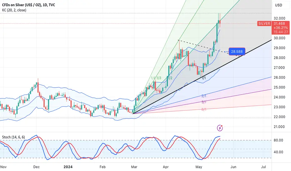
SILVER-SELL strategy Daily chartNo change in view. We are very overbought for SILVER and one can observe the GOLDSILVER RATIO chart cleary identifying we should see a big drop of the precious metal.
I feel we may see test of $ 28.50 area.
Strategy SELL @ 31.50-31.85 and place SL above 32.78 and take profit near $ 28.90.
The bullish scenario based on 5.3.5.3.5Esteemed analysts and traders,
I hope this correspondence finds you in good health and high spirits, prepared to tackle the upcoming week with renewed energy. I extend my best wishes for your continued success in all your business endeavors. It is worth noting that success in trading is largely dependent on the consistent definition and adherence to one's own rules.
As a supporter of the Elliott Wave Principle, I consider this methodology an invaluable tool for market analysis. After three years of personal experience, I have developed my approach by combining this principle with meticulous consideration of different market scenarios. I strive to avoid market surprises by maintaining a range of market prospects, which enables me to recognize the market structure forming with 100% accuracy.
I am pleased to share my analysis with you, with the caveat that I do not provide buy or sell signals. My perspective on idea analysis is entirely impartial, and if my analysis meets your standards, it may serve as a guide to making an informed decision.
For your reference and comparison, I have attached my previous analysis of the same market. All the details of my analysis are clearly labeled for ease of comprehension. Nonetheless, familiarity with the Elliott Wave Principle theory would facilitate an understanding of the analytical idea.
My study of the Elliott Wave Principle took nearly three years, during which my understanding and experience with this invaluable tool have grown. My progress thus far is a testament to the legacy of Ralph Nelson Eliot, whose genius has provided the foundation for my achievements. May he rest in peace.
I express my gratitude for your continued support and kindness, and welcome your comments and critiques.
May my analysis be a valuable asset to your business journey, and I remain sincerely yours,
Mr. Nobody
The bearish scenario of any corrective pattern and trend continuation
